📅 Monthly Analysis Report
Moneytor’s Monthly Analysis report gives you deep, visual insights into your financial life for any given month. It’s designed to show you exactly where your money came from, where it went, and how your performance changes over time. This guide explains how to use this powerful report, from its interactive charts to its detailed data tables.
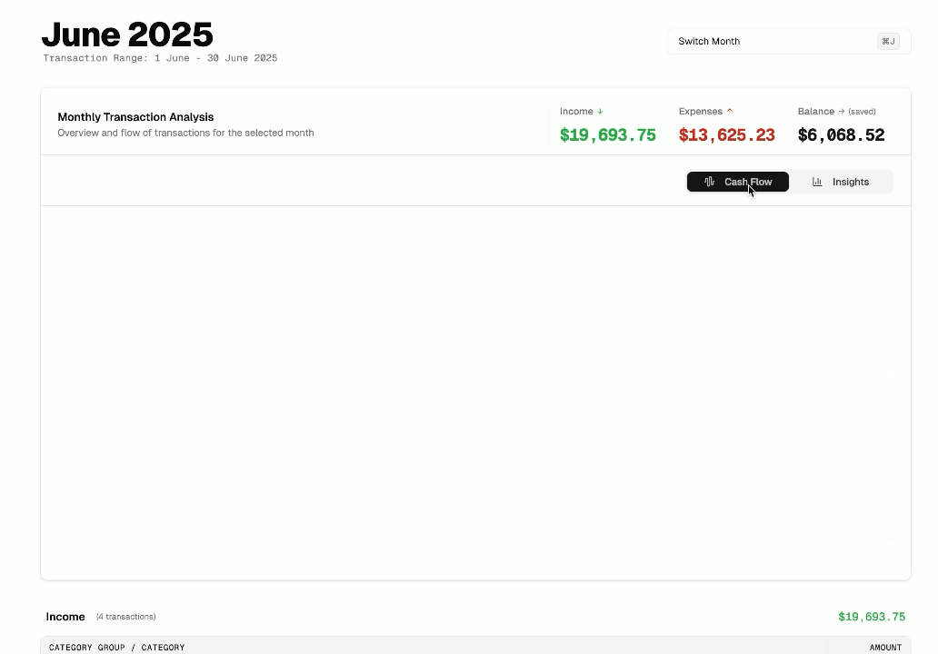
Choosing a Month
The first step is always to select the period you want to analyze. Use the Month Selector at the top of the page to choose any month and year. All the data and charts on the page will automatically update to reflect your selection.
Understanding Your Report Views
The Monthly Analysis report offers two distinct views, which you can switch between using the toggle buttons at the top right of the page: Cash Flow and Insights. Each view is designed to give you a different perspective on your financial data for the selected month.
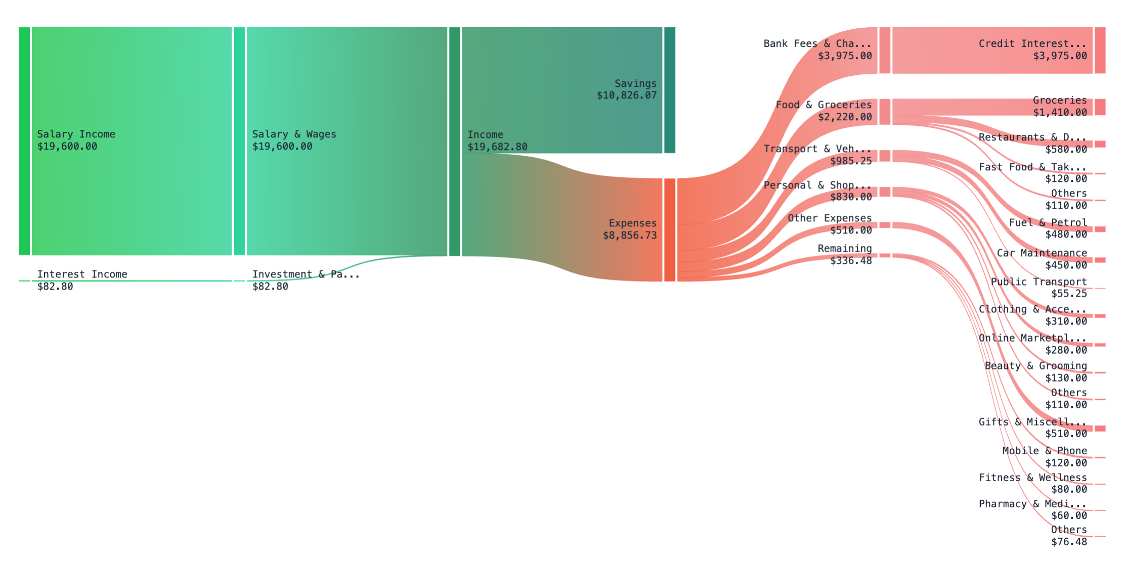
- Cash Flow View: This is the default view, featuring a Sankey chart. It’s designed to show you the complete flow of your money—from every income source, through to your total expenses, and finally broken down by category.
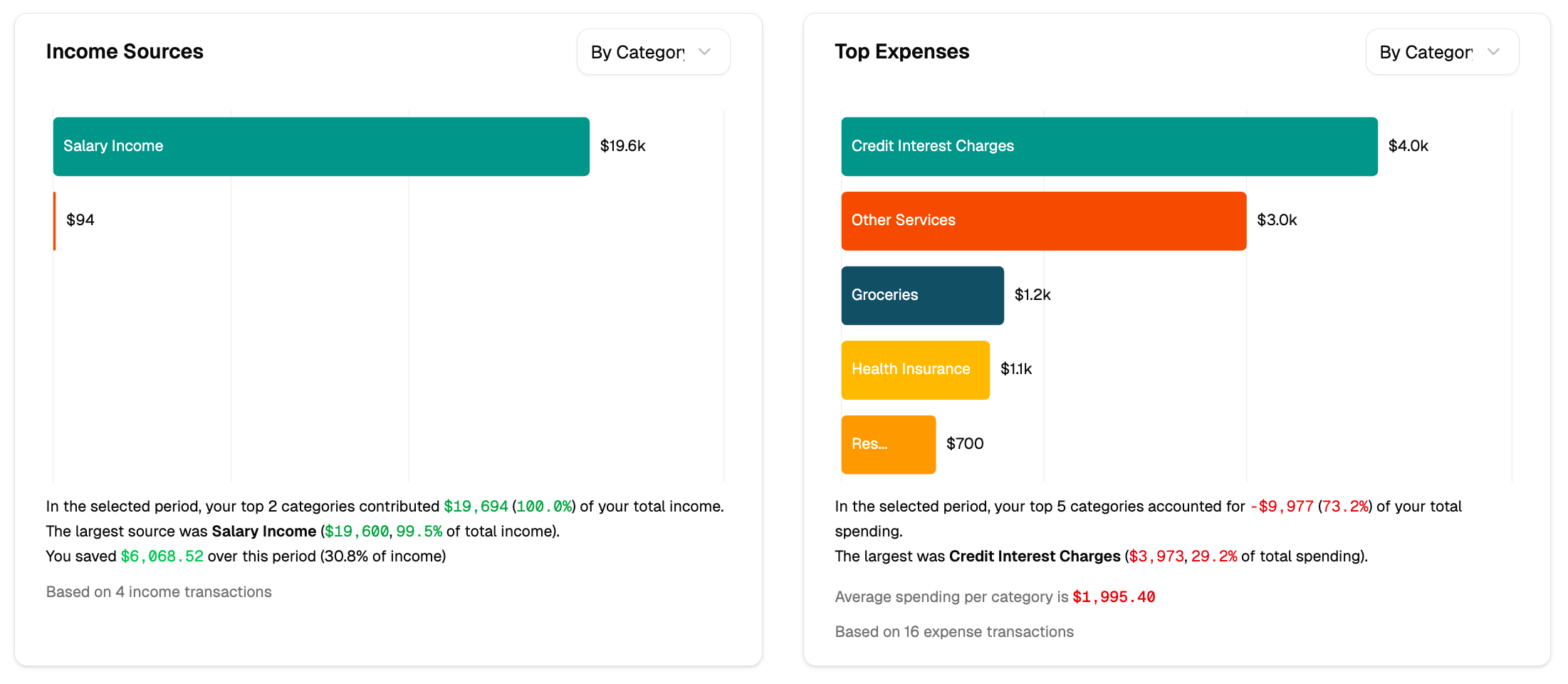
- Insights View: This view uses a series of bar charts to highlight your top income sources and expense categories. It’s perfect for quickly identifying the most significant financial activities of the month.
The ‘Cash Flow’ View (Sankey Chart)
The Cash Flow view uses a powerful Sankey chart to map out the journey of your money during the selected month. It’s designed to give you an intuitive, high-level understanding of how your income is distributed across all of your expenses and savings.
How to Read the Chart:
- Follow the Flow: Read the chart from left to right. It starts with your individual income sources, which merge into your total income. This total then branches out into your various expense categories and what remains as savings.
- The Wider the Flow, the Bigger the Amount: The width of each band is proportional to the amount of money it represents. A thicker band signifies a larger financial impact, making it easy to spot your biggest income sources and spending areas.
- Get Details by Hovering: The chart is interactive. Hover your mouse over any flow or category to see a tooltip with the exact dollar amount and other relevant details.
- Colour-Coded for Clarity: Each category is assigned a different colour, making it easy to visually distinguish between different types of expenses.
The ‘Insights’ View: Your Top Categories
When you want a quick summary of the most significant financial activity for the month, the Insights view is the perfect tool. Instead of showing the overall flow of money, this view uses bar charts to highlight the income sources and expense categories that have the biggest impact on your budget.
This view is broken down into two main sections:
Top Income Sources
This chart displays your largest sources of income for the month, ranked from highest to lowest. Below the chart, you’ll find a plain-language summary that provides key insights, such as what percentage of your total income your top sources represent.
Top Expenses
Similarly, this chart shows your top expense categories, making it easy to see where most of your money went at a glance. The text summary below offers valuable information, like how much your top categories contributed to your total spending and what your average spending was per category.
On each chart, you can use the dropdown menu to switch between viewing by Category or Category Group, allowing for either a granular or a high-level perspective.
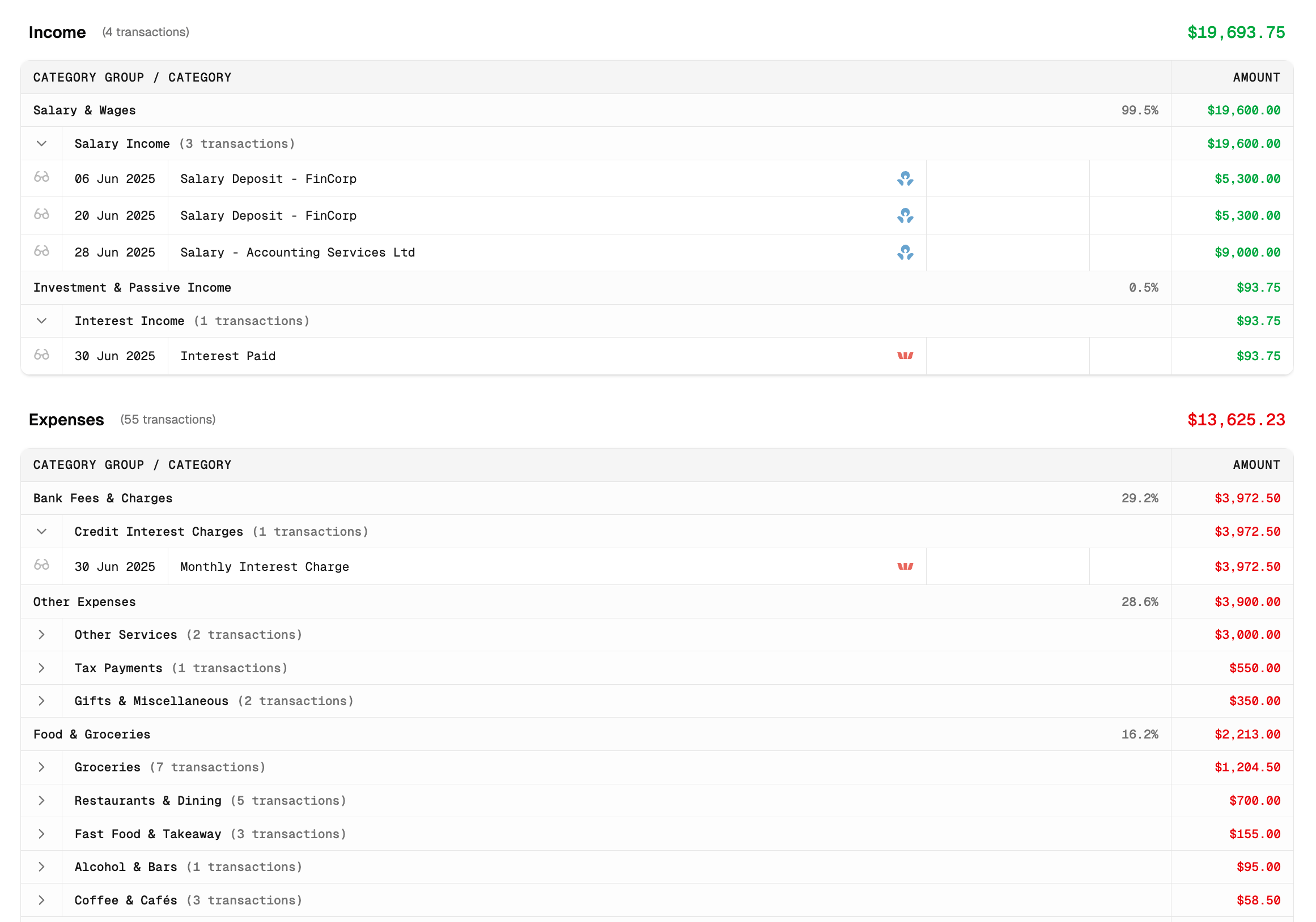
The Detailed Data Breakdown
Below the visual charts, you’ll find a complete, line-by-line breakdown of all your income and expenses for the selected month. This table provides the most granular view of your finances and is perfect for when you need to see the specific transactions that make up your monthly totals.
Key Features of the Data Table:
- Grouped by Category: Your transactions are neatly organized by category and then by category group, making it easy to see how much you earned or spent in each area.
- Expandable Details: You can click on any category row to expand it and view all the individual transactions within it. This is perfect for understanding exactly what makes up a category’s total.
- Clear Financials: For each category, the table shows the total amount and its percentage contribution to your overall income or expenses for the month.
Comparing Across Months
To understand how your finances evolve over time, you can switch from viewing a single month to comparing a range of months. This feature is perfect for spotting trends, tracking your progress against goals, and seeing how your spending habits change from one month to the next.
How to Start a Comparison
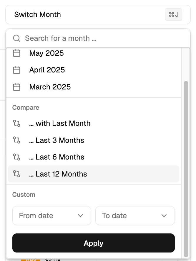
- Click the “Switch Month” button at the top of the report.
- In the panel that appears, go to the “Compare” section.
- Choose one of the presets (e.g., … Last 3 Months, … Last 6 Months) or define a Custom date range.
- Click “Apply”. The report will reload in comparison mode.
Understanding the Comparison View
When comparing months, the entire report adapts to show you trends over the selected period:
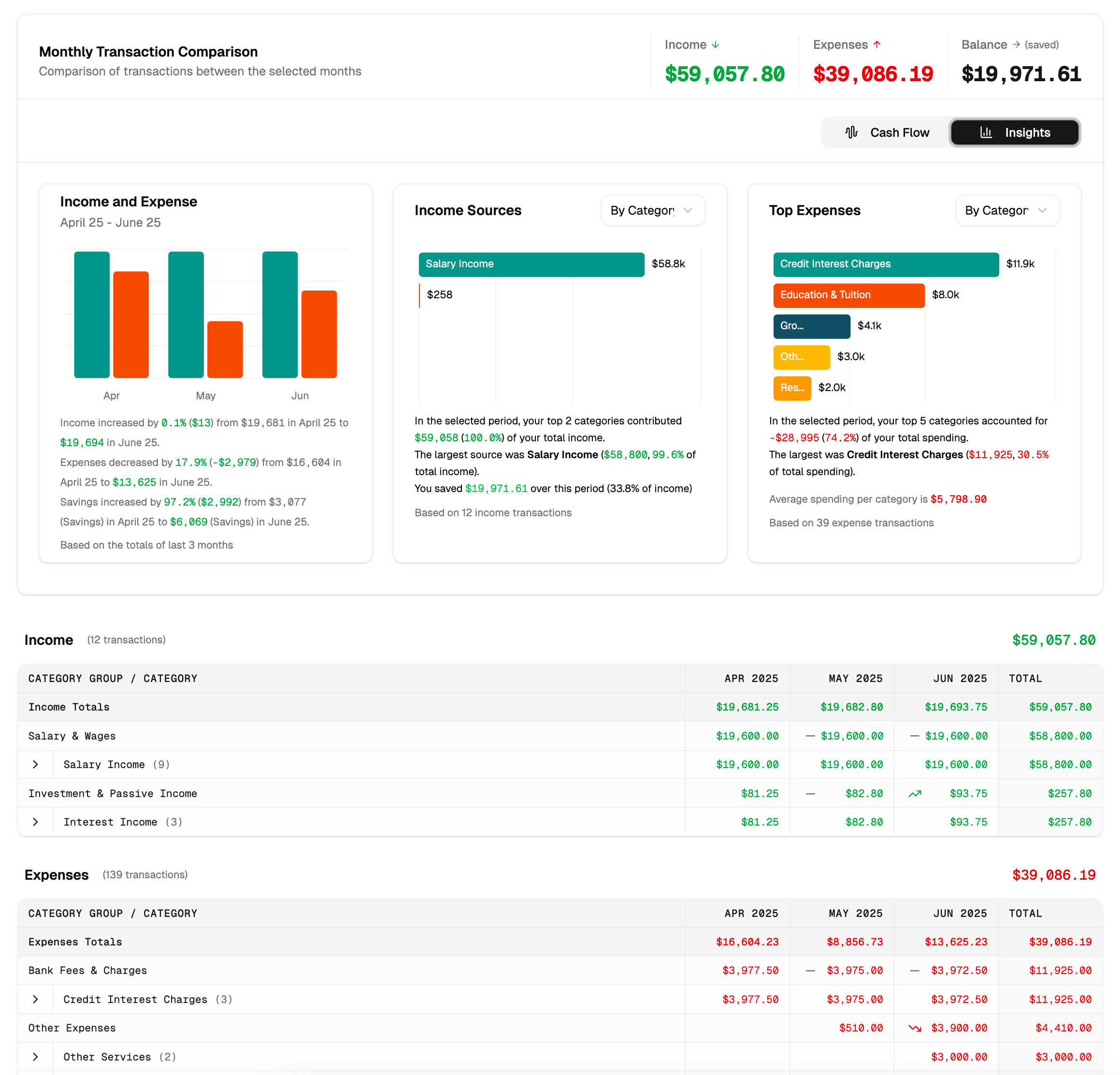
- Combined Totals: The main header displays the total income, expenses, and balance for the entire date range.
- Monthly Comparison Chart: A new “Monthly Transaction Comparison” chart appears at the top left. This provides a side-by-side bar chart of your income and expenses for each month in your selected range, along with a text summary highlighting the percentage changes and key takeaways.
- Period-Wide Visuals: The “Cash Flow” (Sankey) and “Insights” charts will now show aggregated data for the full period you selected, giving you a big-picture view.
- Multi-Column Data Table: The detailed data table at the bottom expands to show separate columns for each month plus a “Total” column, making it easy to compare specific category spending side-by-side.
Filtering Your Report
To narrow down your analysis and focus on specific data, you can use the powerful filtering tools available on the report page. This allows you to look at just the information that is most relevant to you.
You can filter by:
- Category or Group: Use the search bar to find and focus on one or more specific categories or groups.
- Tags: Filter the report to only show transactions that have a specific tag you’ve assigned.
- Accounts: Isolate the data to one or more of your financial accounts.
- Uncategorised: Quickly find all transactions that still need to be categorised.
Tips for Getting the Most from Your Report
- Use the Sankey Chart for the Big Picture: The ‘Cash Flow’ view is the best way to quickly understand how all the pieces of your financial puzzle fit together.
- Compare Months to Find Habits: Regularly use the comparison feature to spot trends like lifestyle inflation, seasonal spending changes, or progress you’ve made on your budget.
- Filter to Answer Specific Questions: Don’t just look at the overview. Use the filters to answer specific questions like, “How much did I spend on ‘Takeout’ from my primary bank account this month?”
- Keep Your Data Tidy: For the most accurate reports, make it a habit to regularly check for and address any uncategorised transactions.